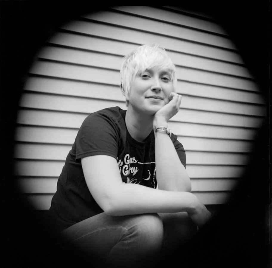
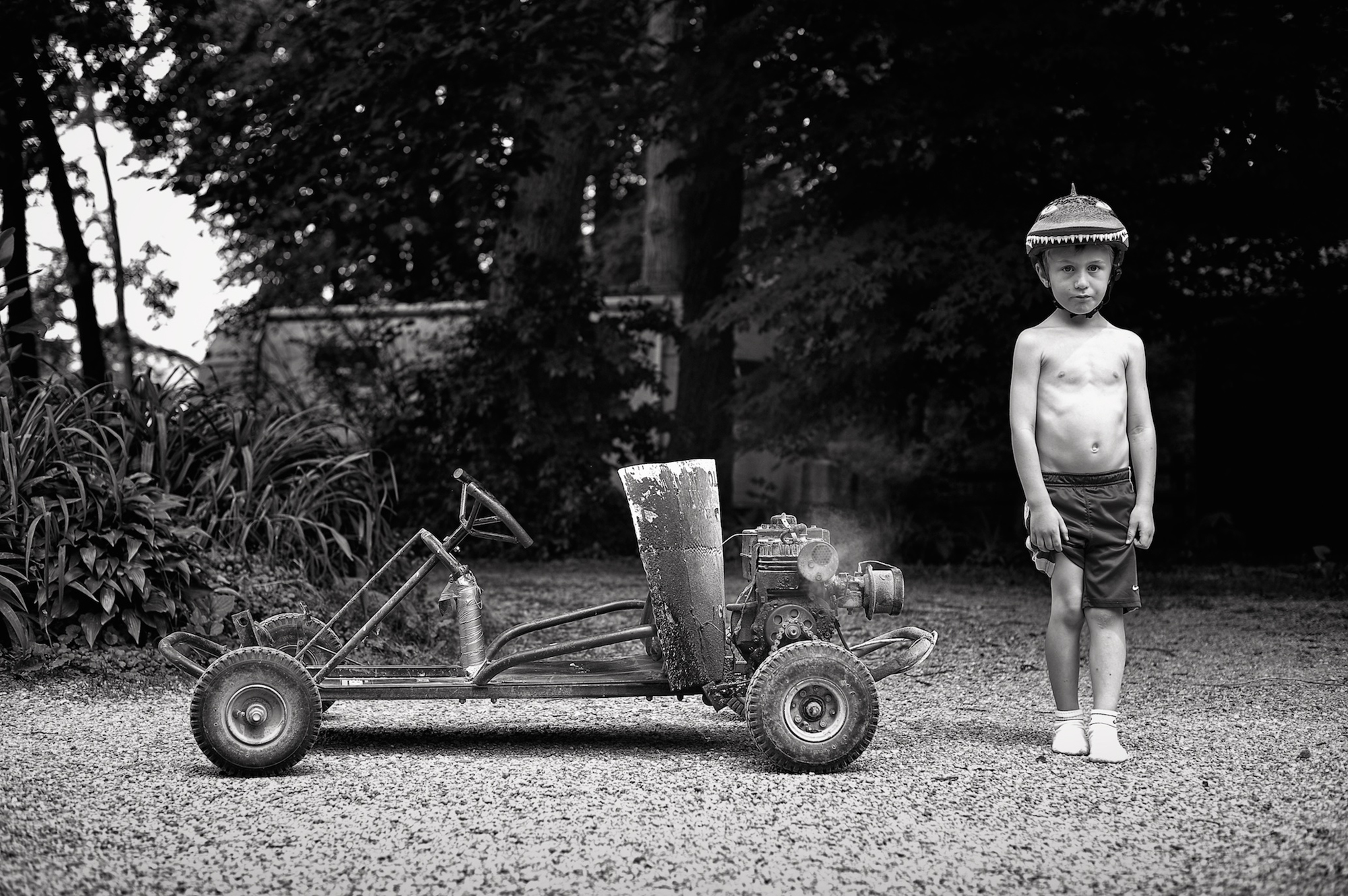
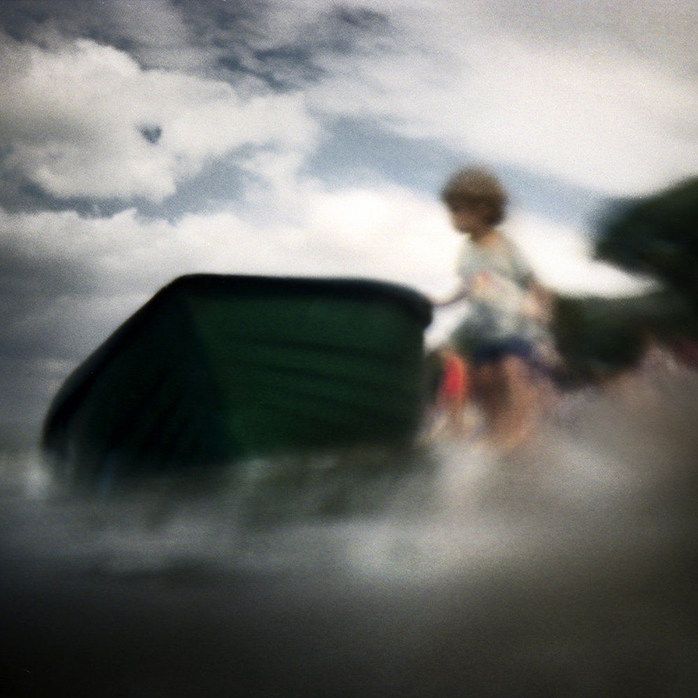
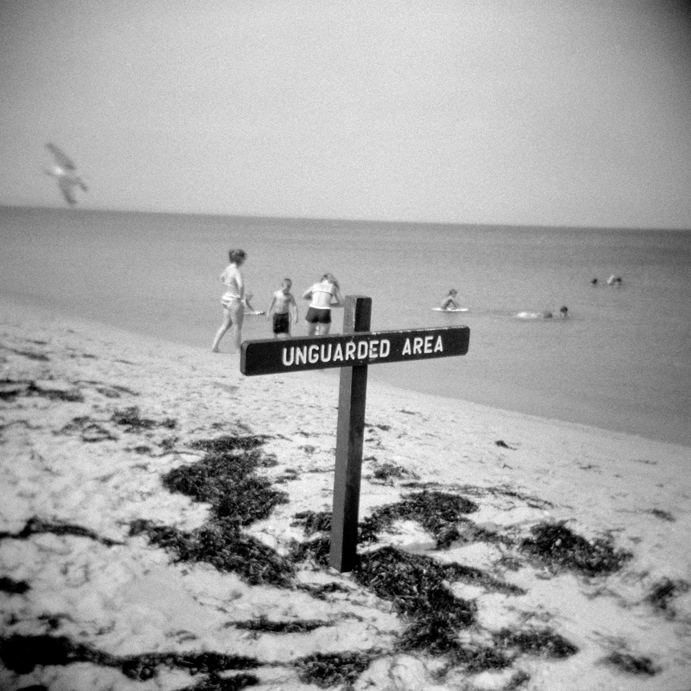
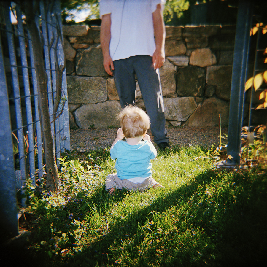
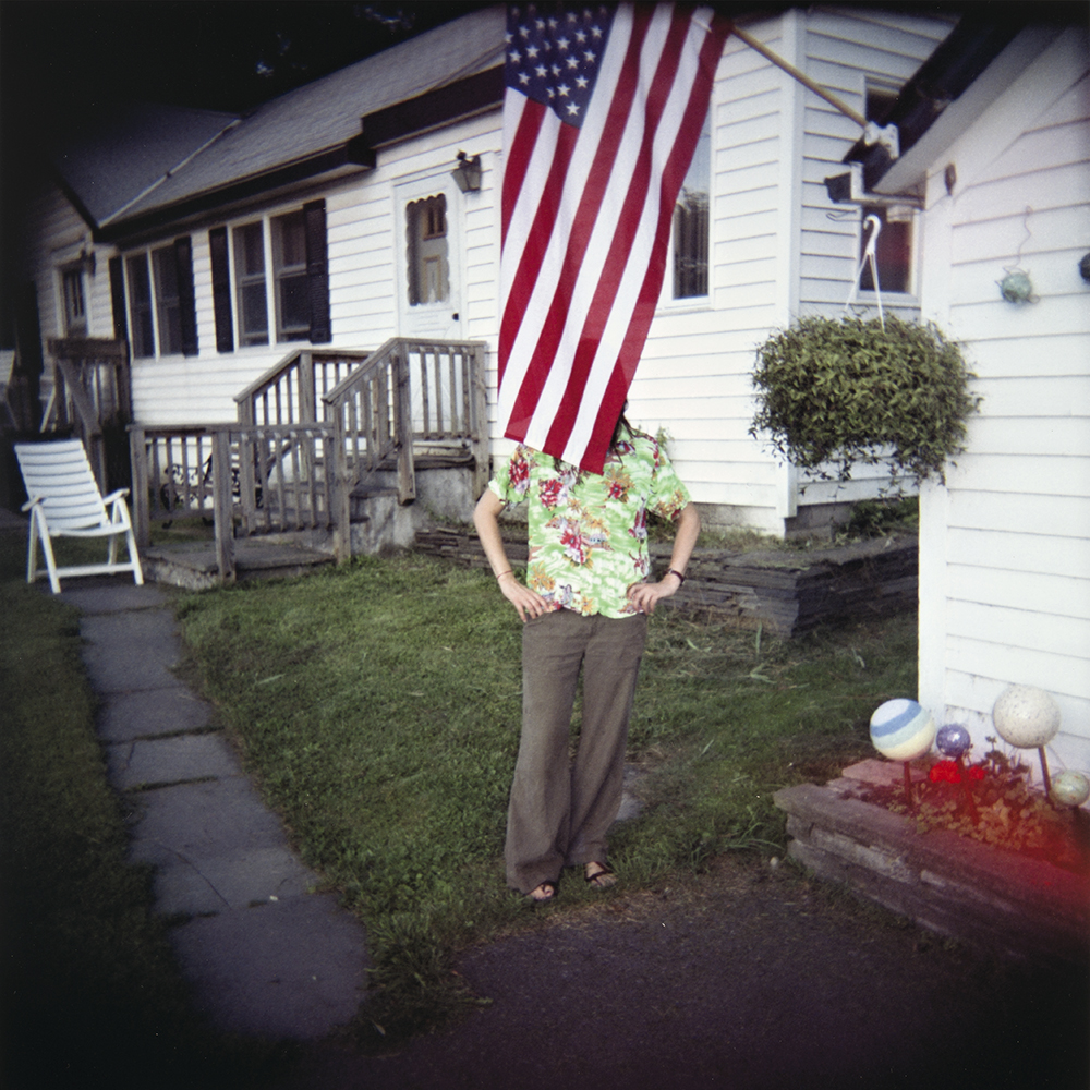
Photographer: Bruce R. Wahl
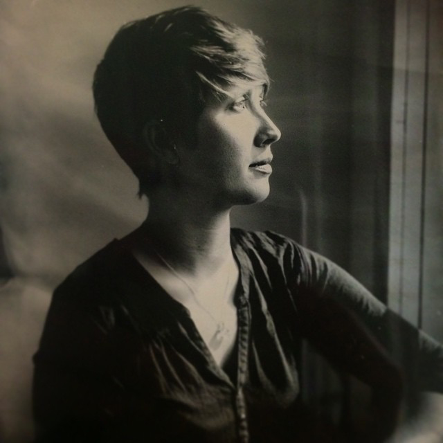
Elizabeth “Liz” Ellenwood will be leaving Panopticon Imaging to pursue her Master’s Degree in Photography at the University of Connecticut! We are so very proud of her and her decision to go back to school. Sadly, she will be leaving Panopticon on July 8th to move and get settled in her new home. We hope that you have time to stop by or give her a call and wish her luck.
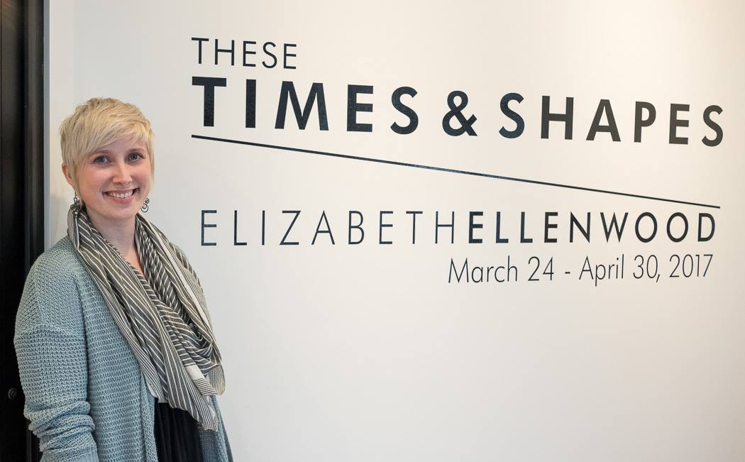
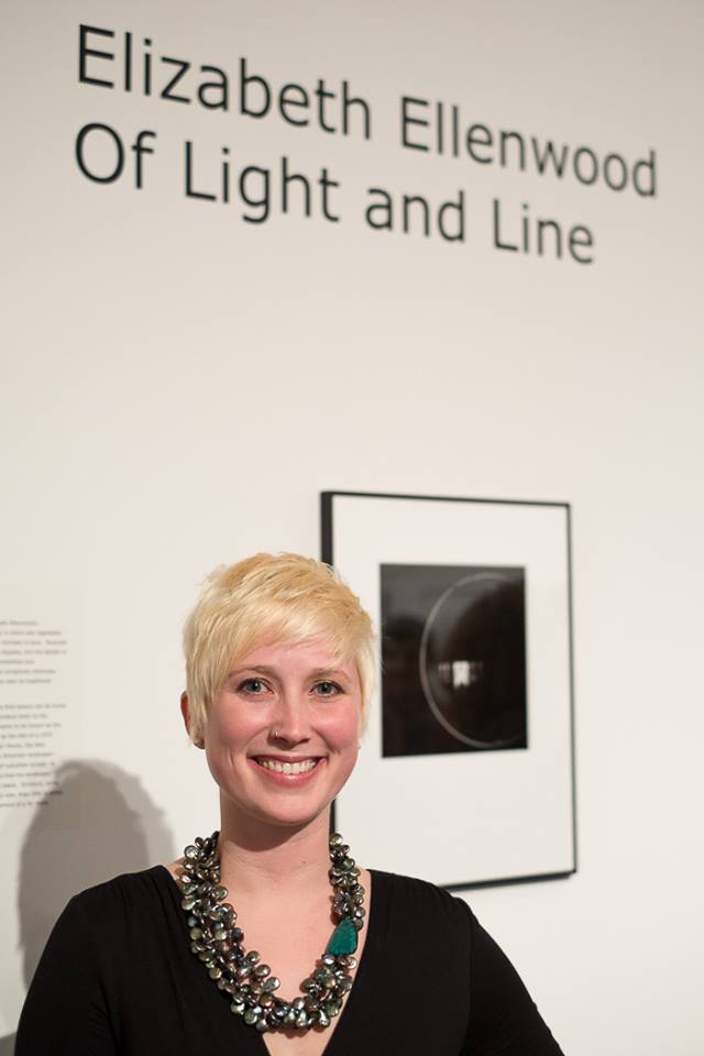
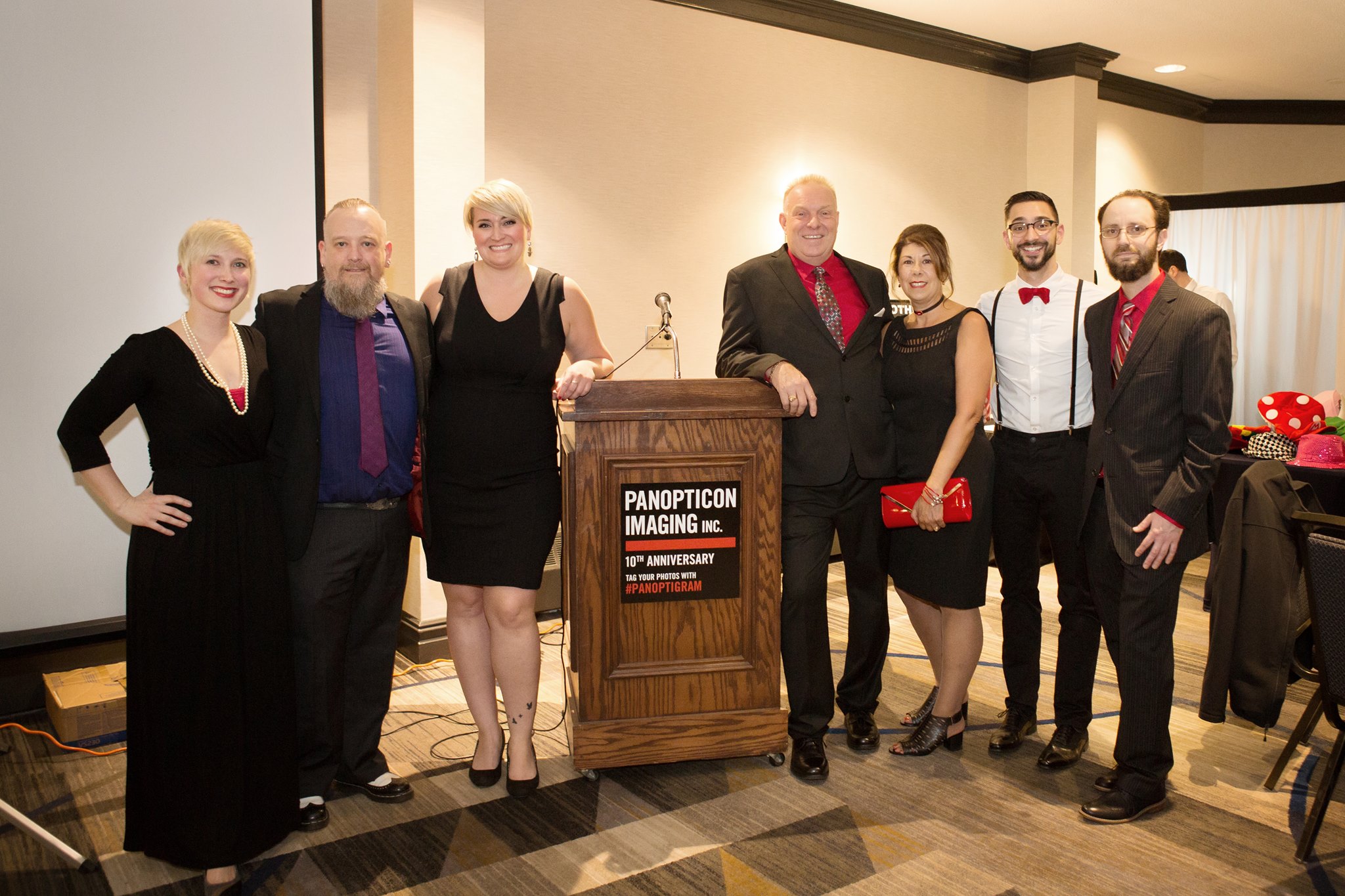
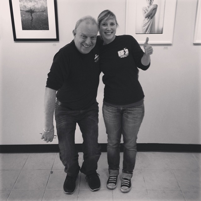
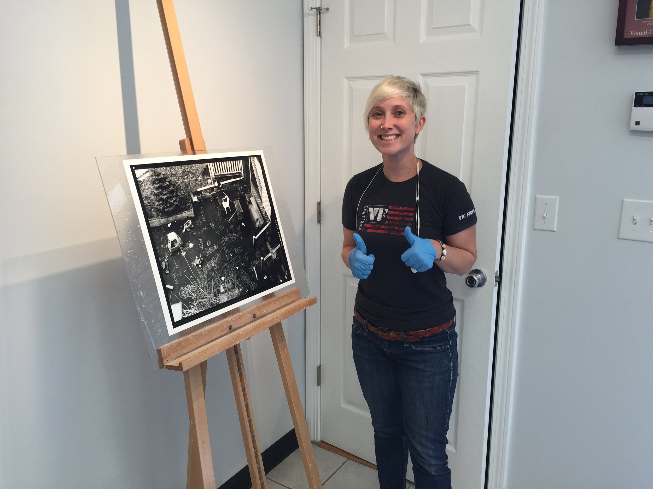
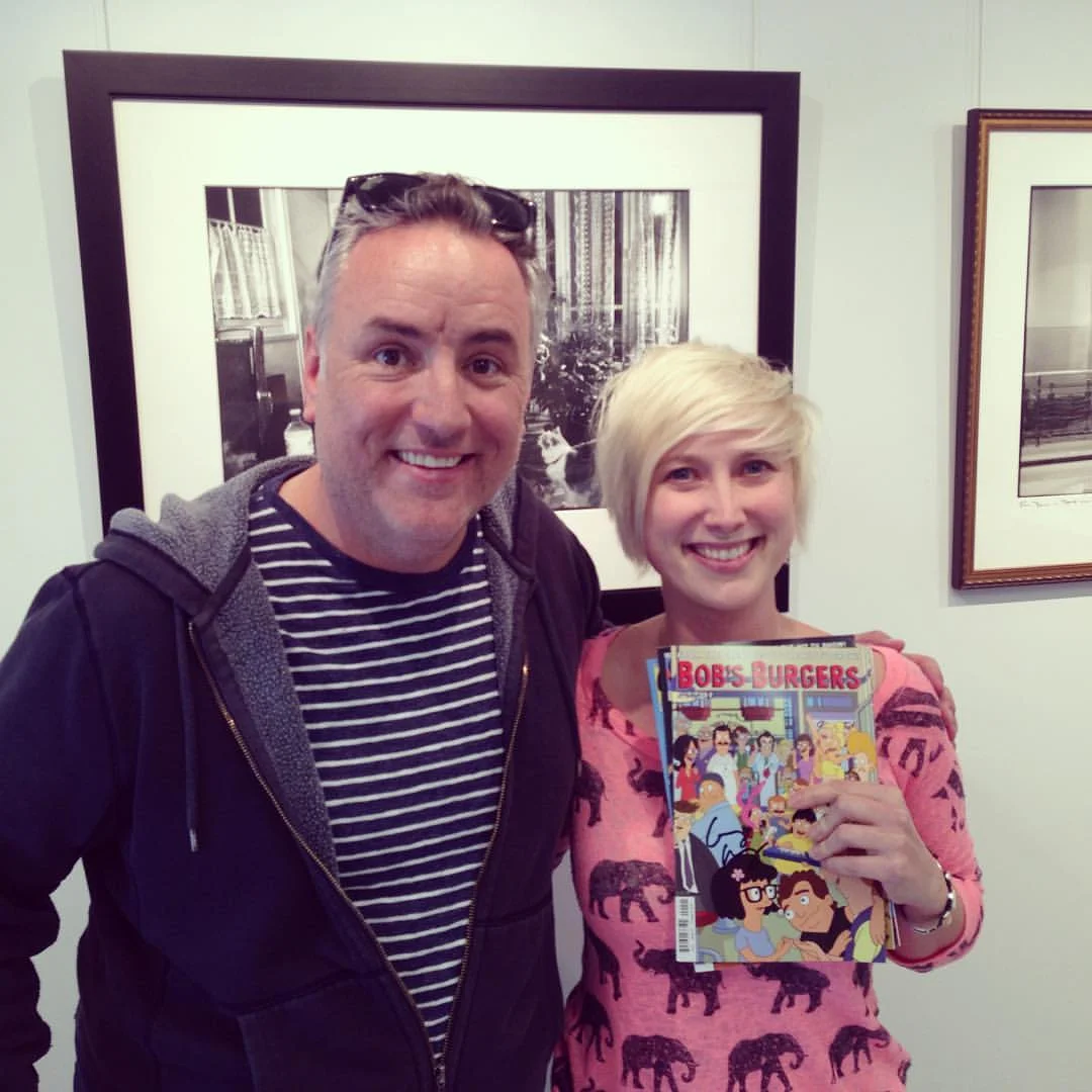
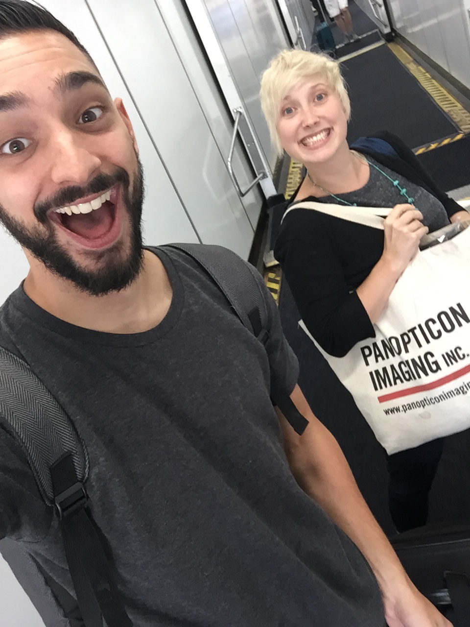
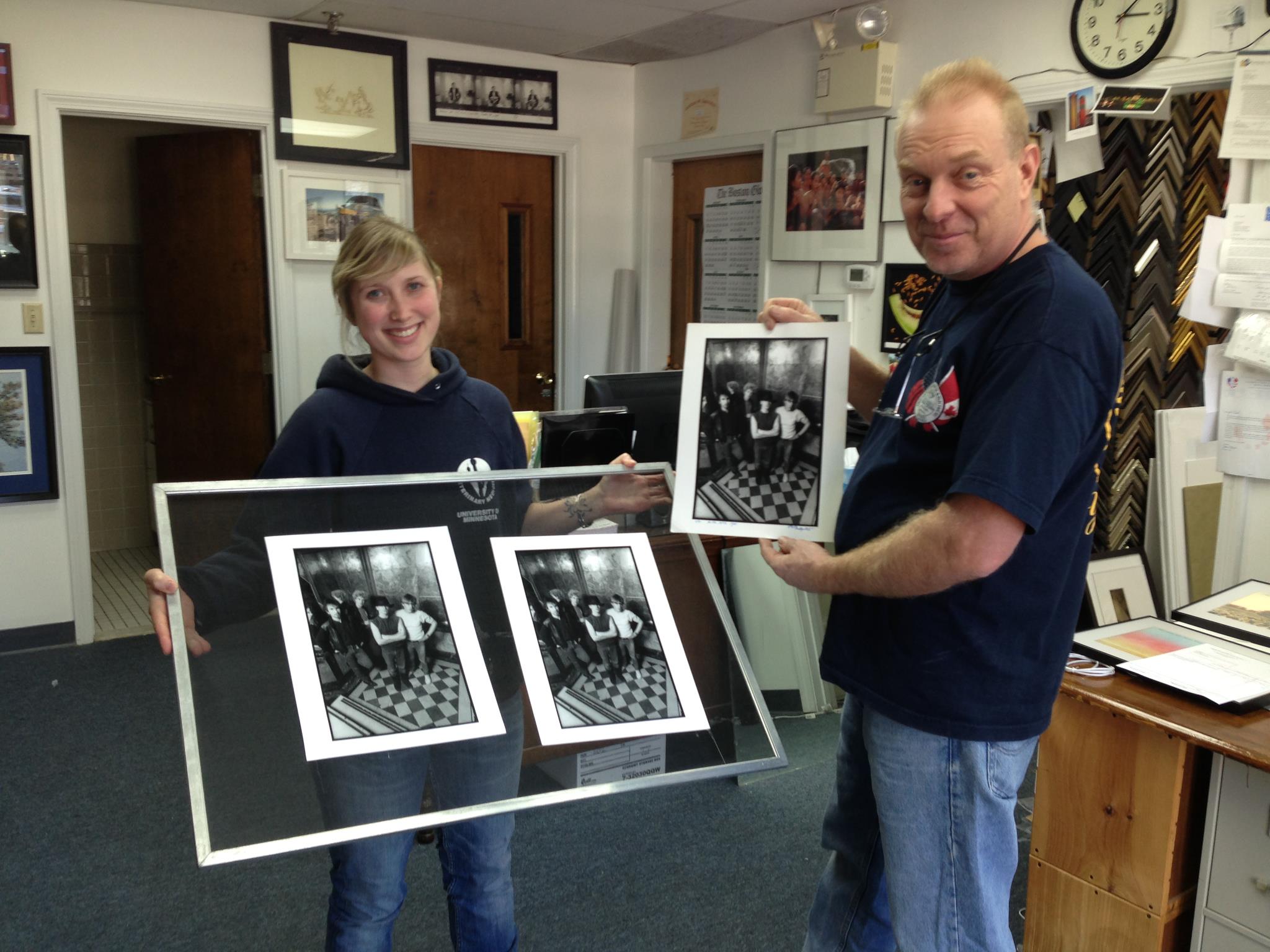
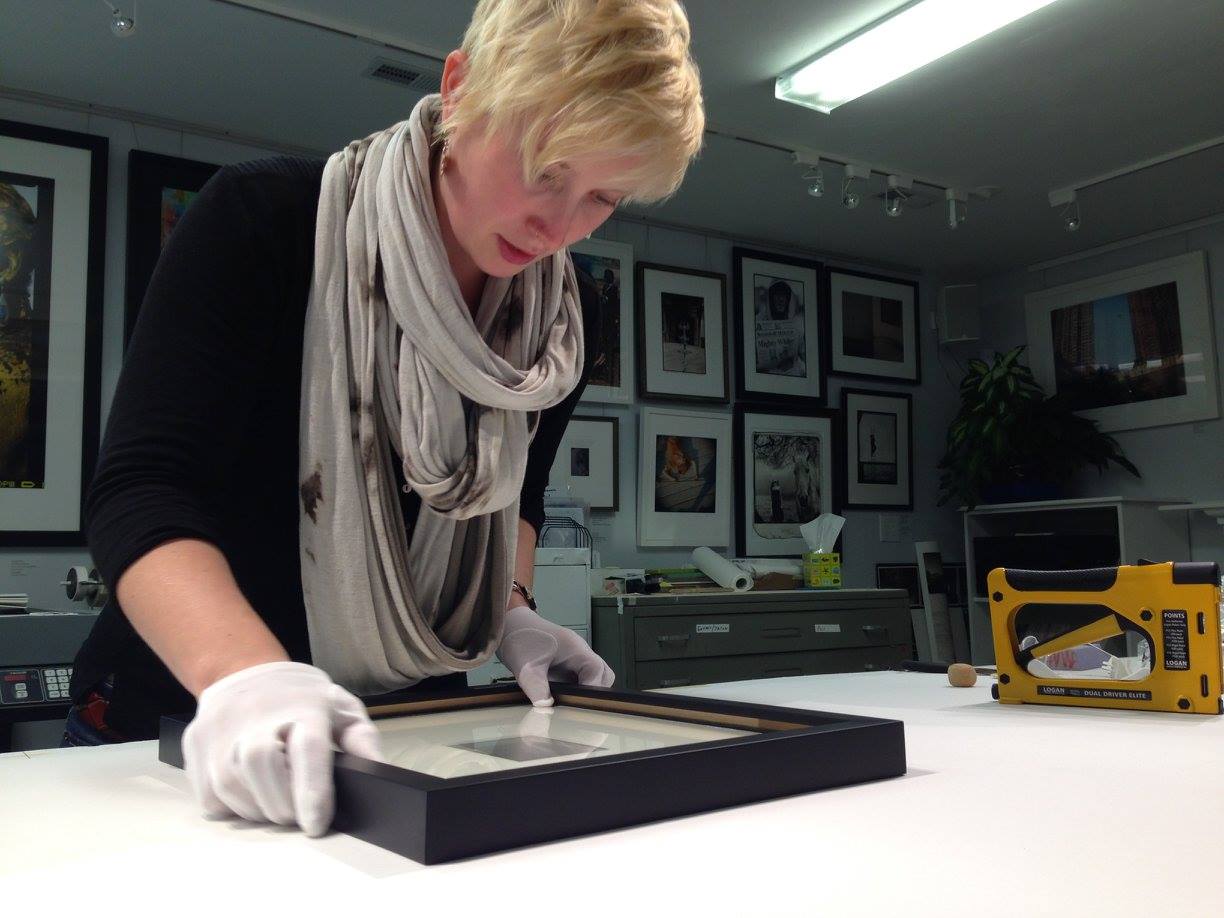
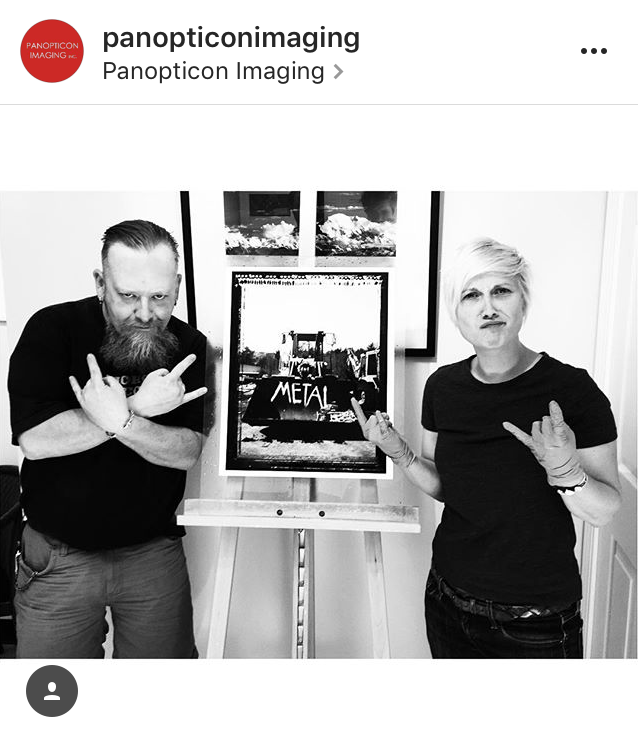
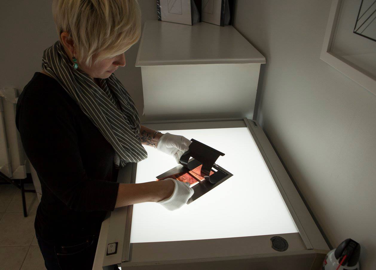
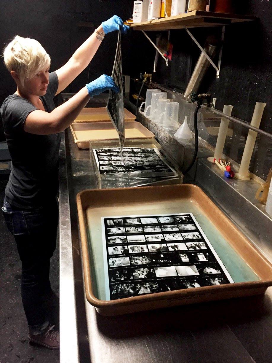
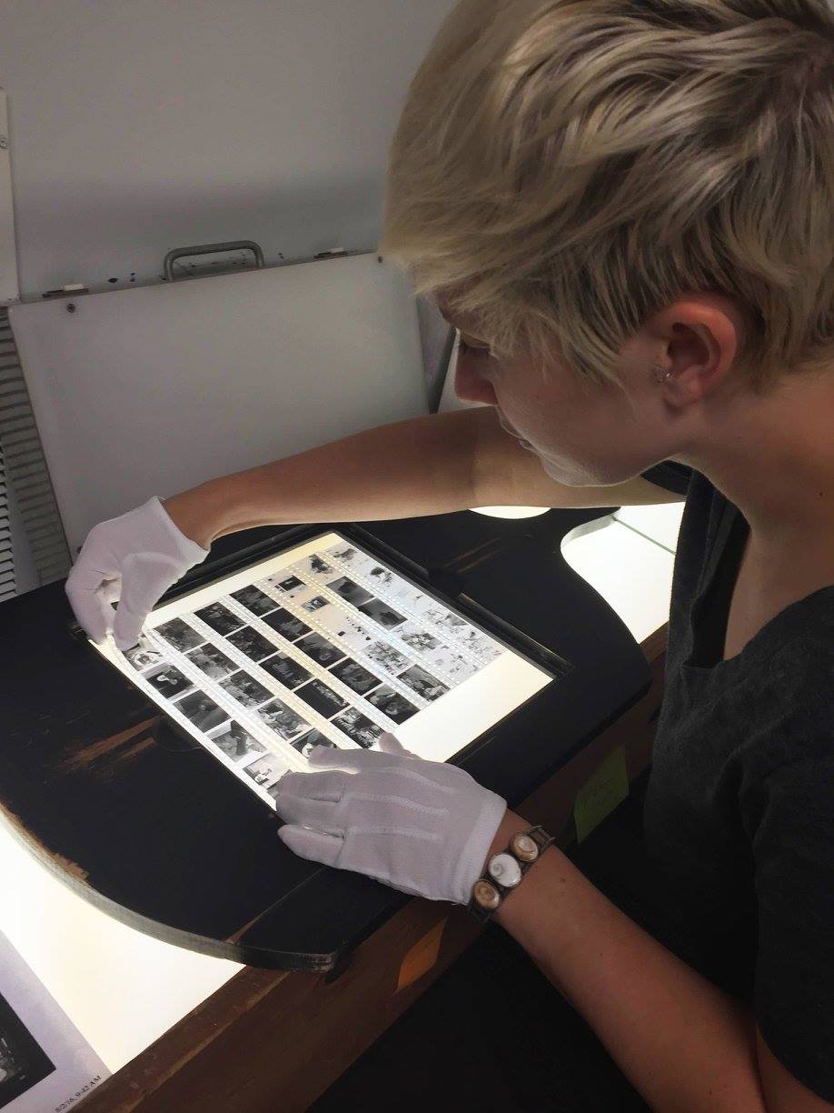
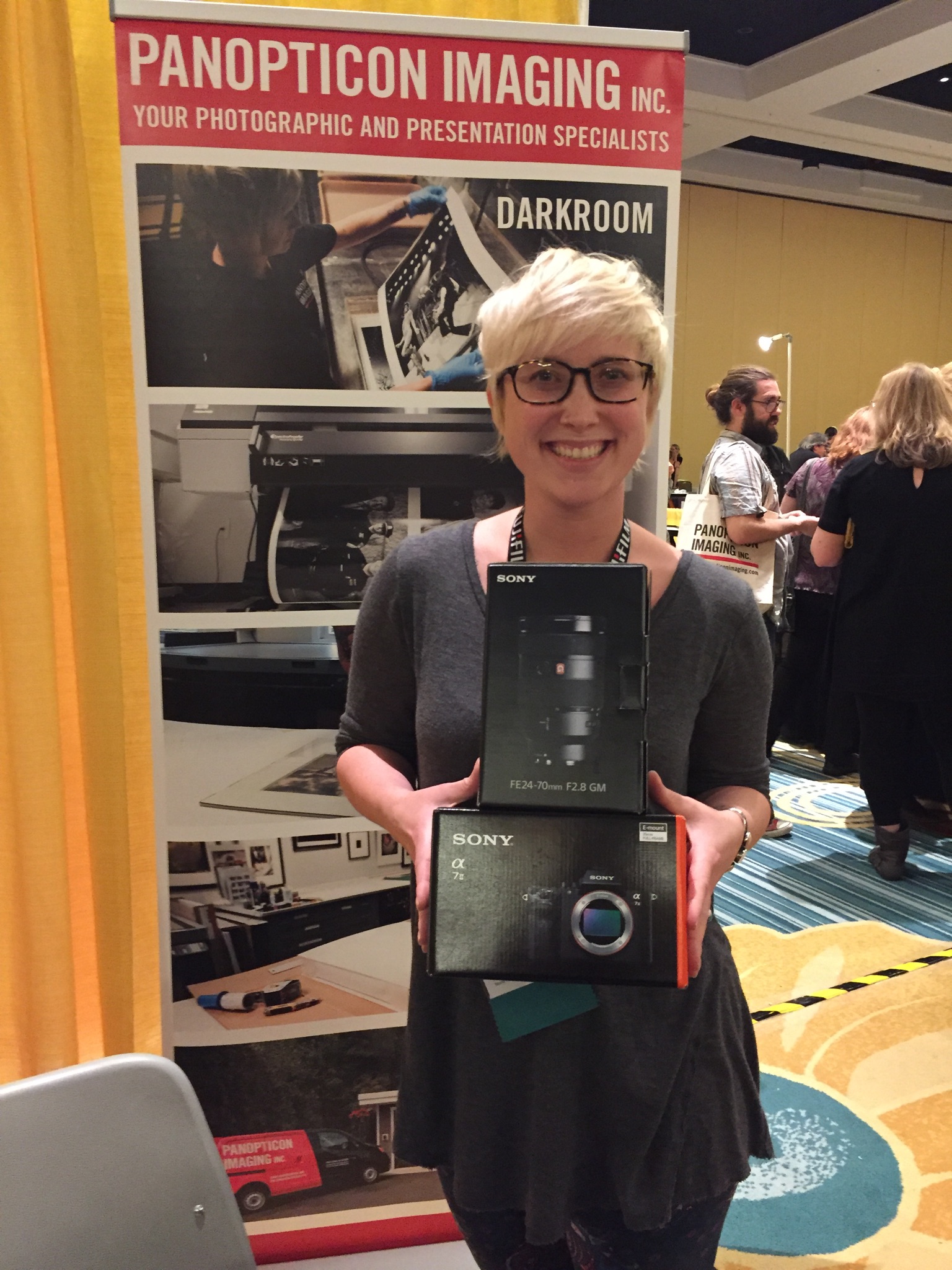
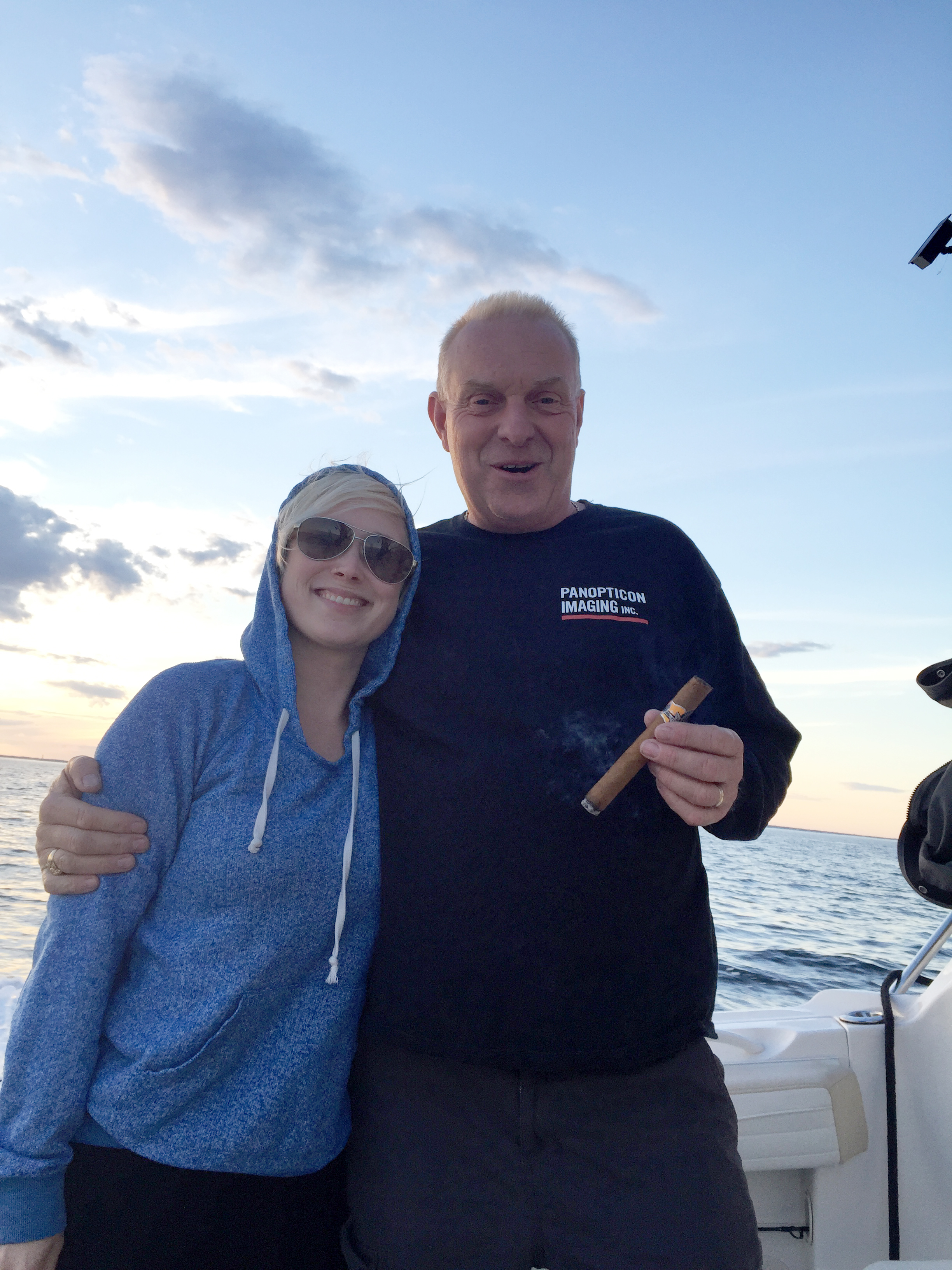
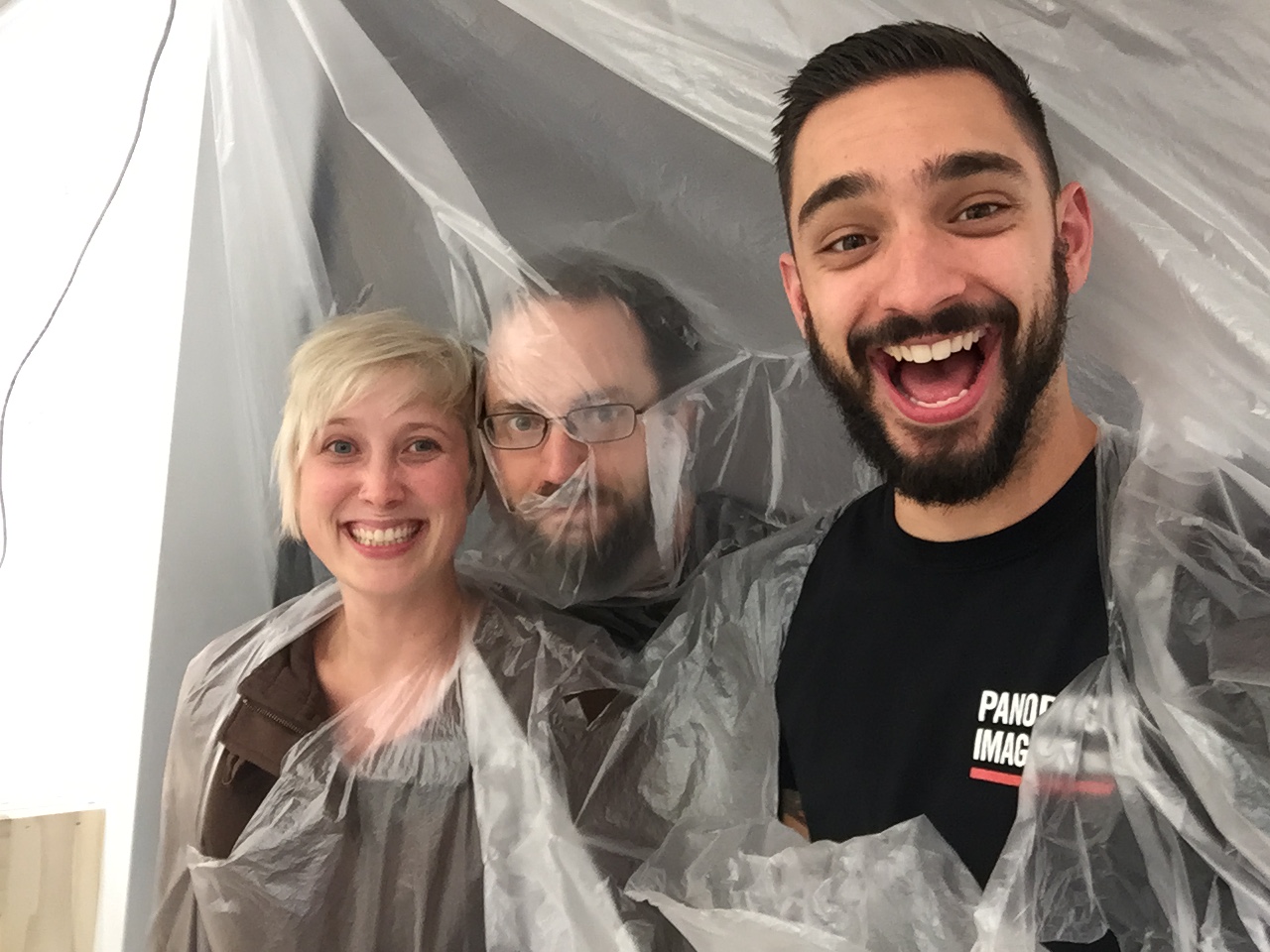
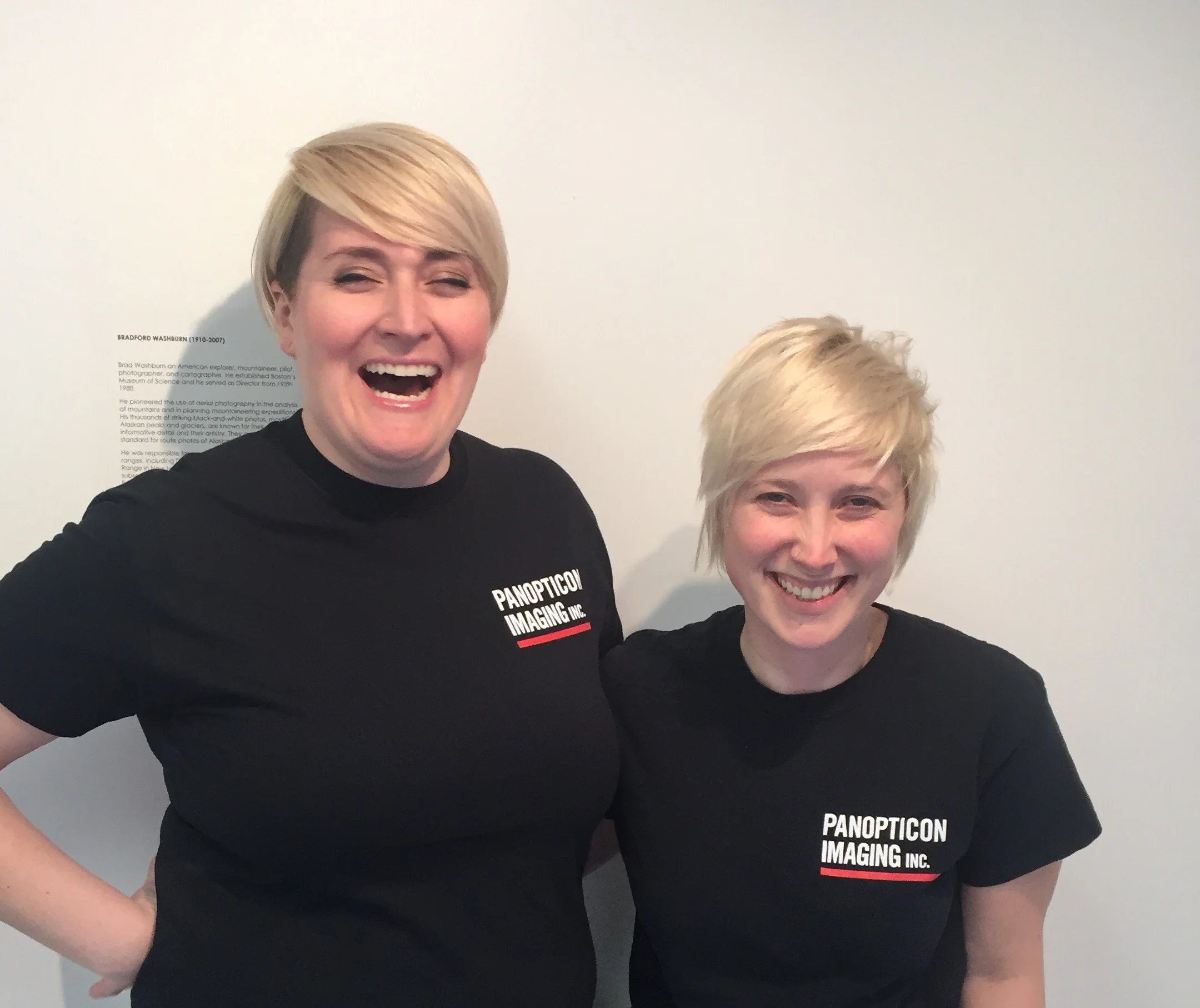
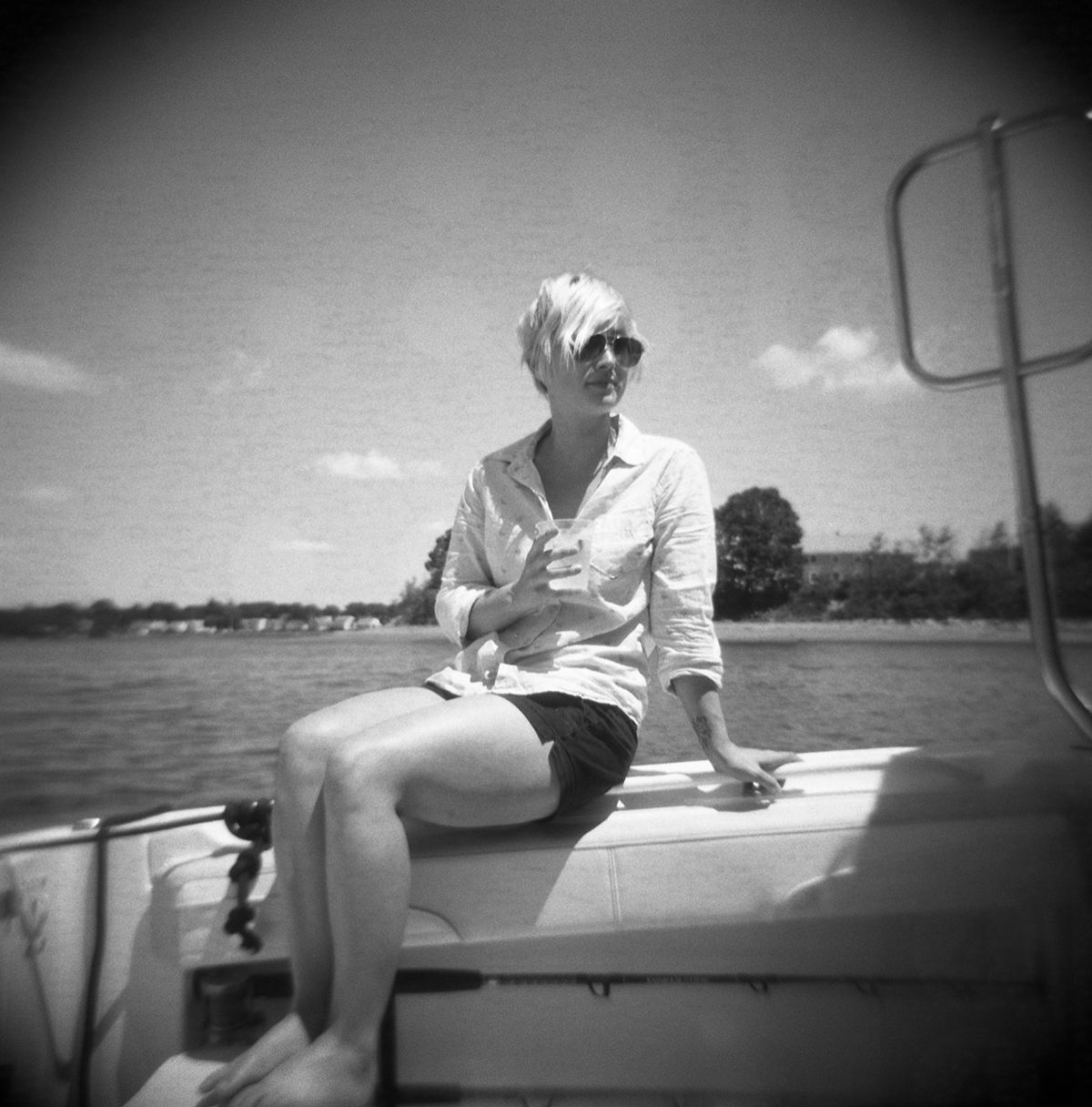
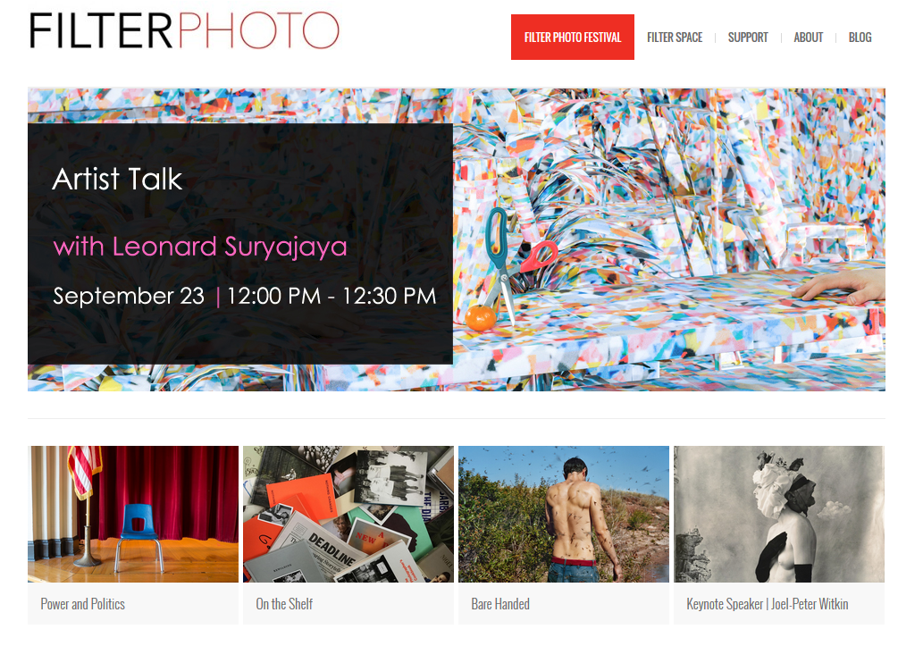
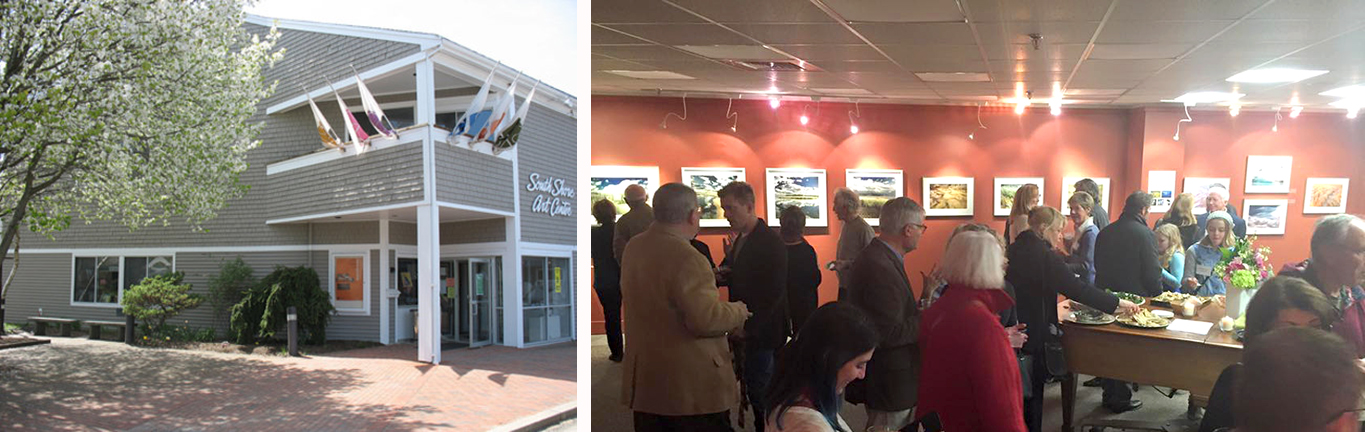
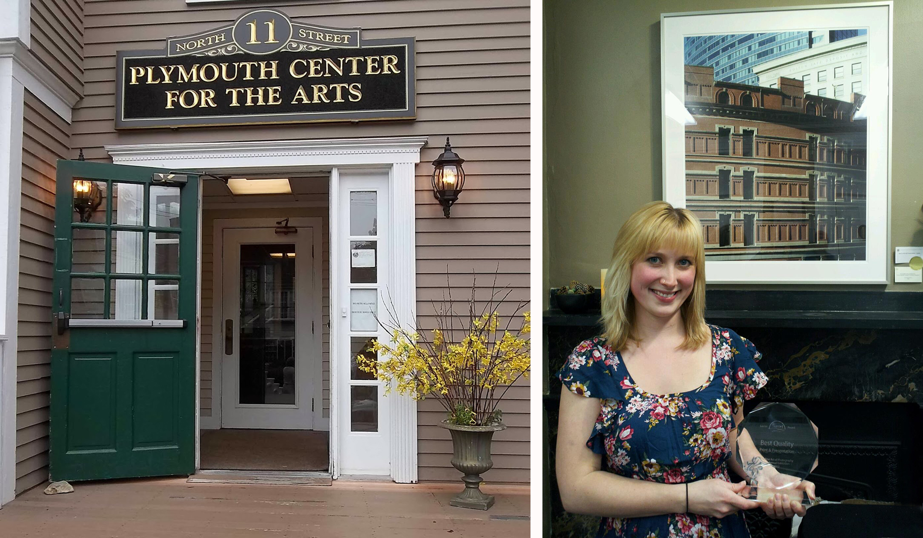
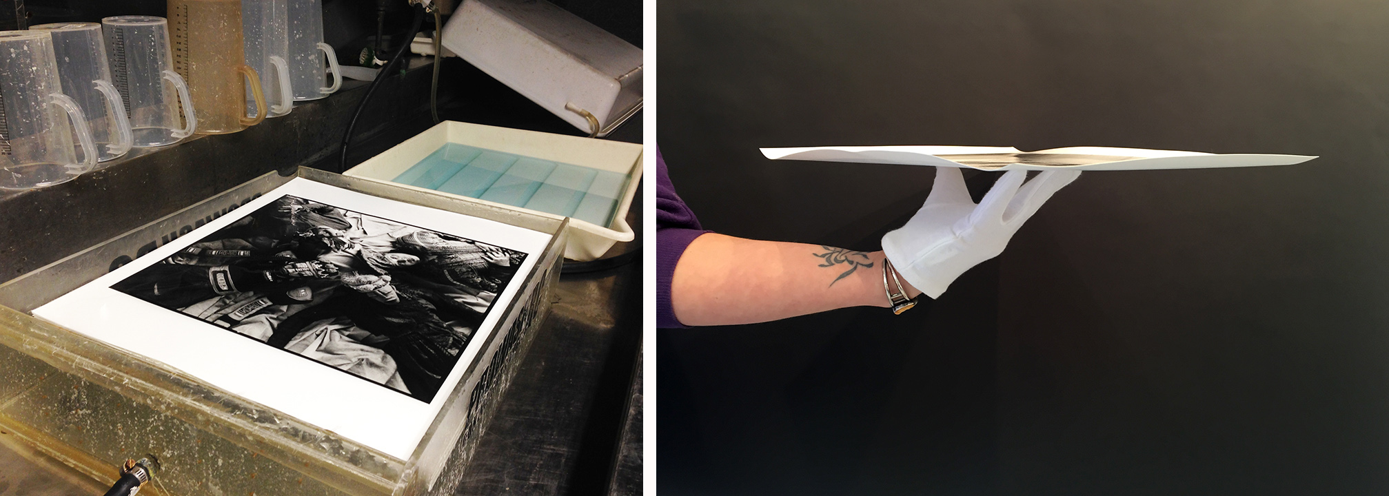
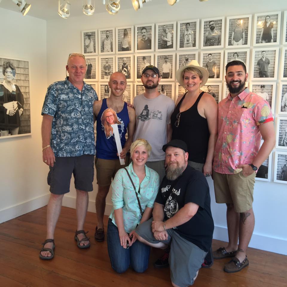
We wanted to share some of the wonderful times we’ve had over the years. Liz has been an integral part of Panopticon Imaging since 2012. She met Paul while interning at Panopticon Gallery. Shortly thereafter she started working one day a week and eventually became a full time staff member. Her first project was working with Paul in the darkroom printing Harold Feinstein. Liz loved working directly with photographer Tony King both in Massachusetts and his home in Maine. Not to forget the darkroom and digital clients whom she shared her insight with over the years (I could go on for a very long time). She represented Panopticon at Filter Photo Festival and the local and national Society for Photographic Education conferences. Also, we were able to share in her photographic milestones of solo exhibitions: “Of light and Line” at Danforth Art and “These Times and Shapes” at Sharon Arts Center Gallery.
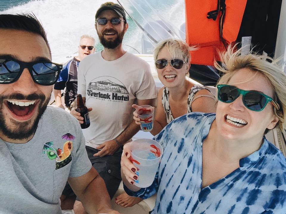
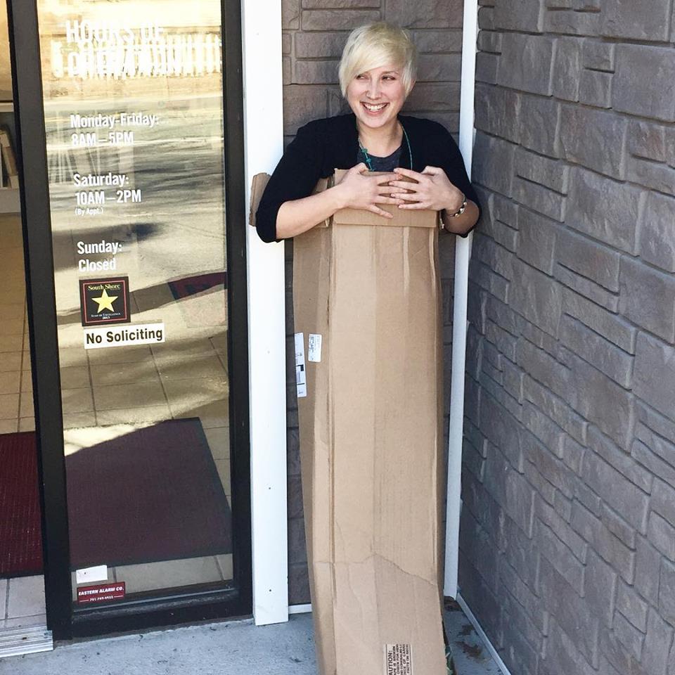
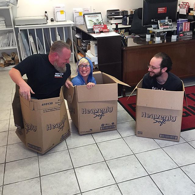
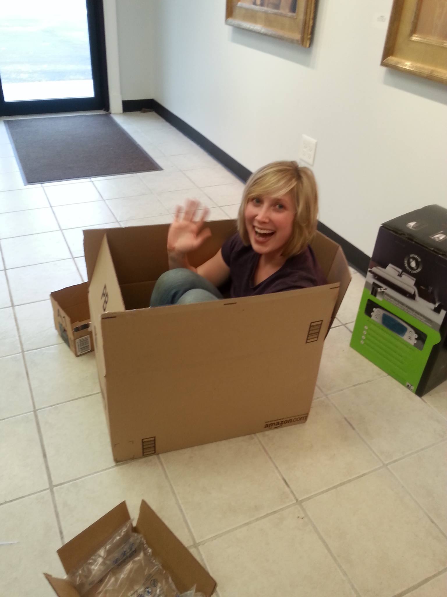
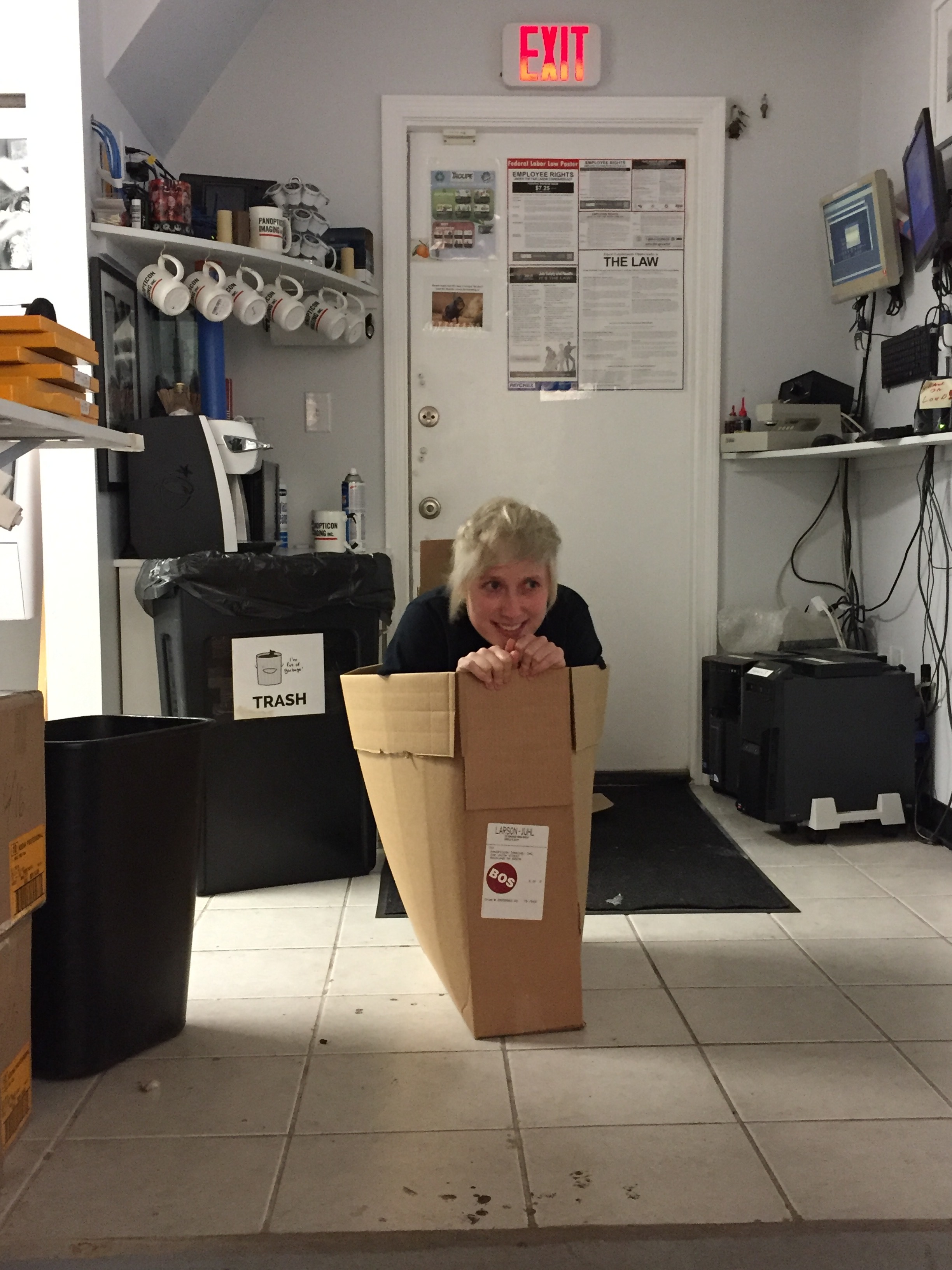
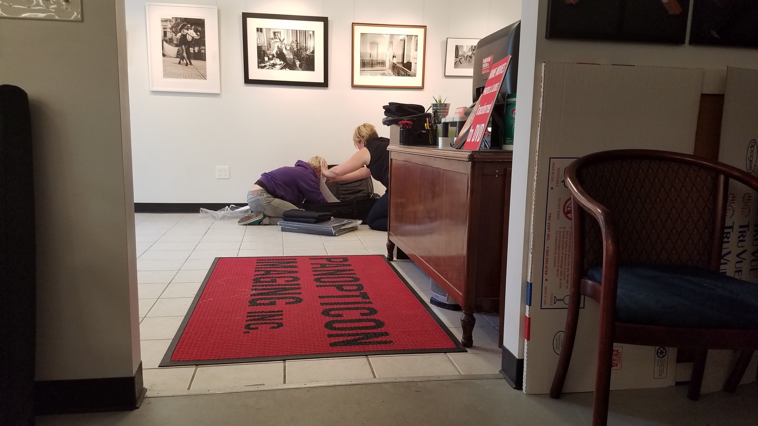
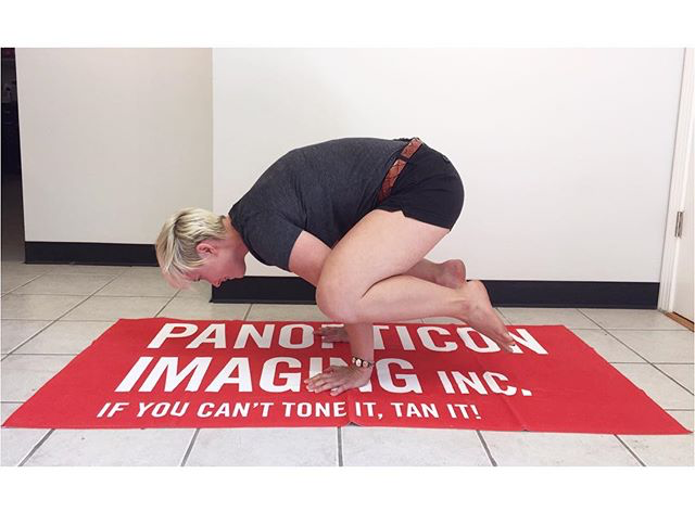
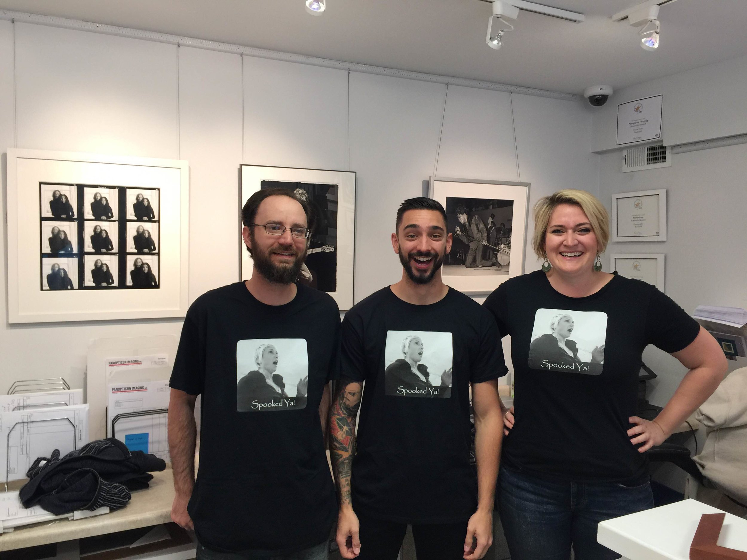
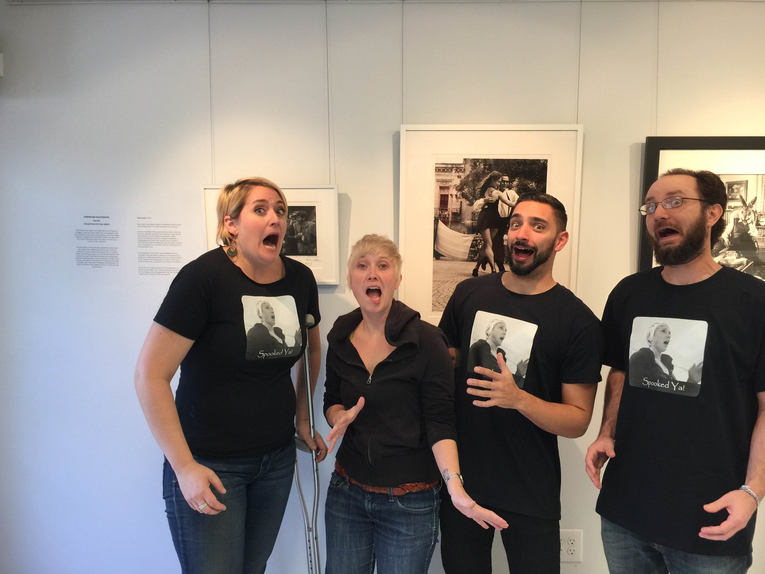
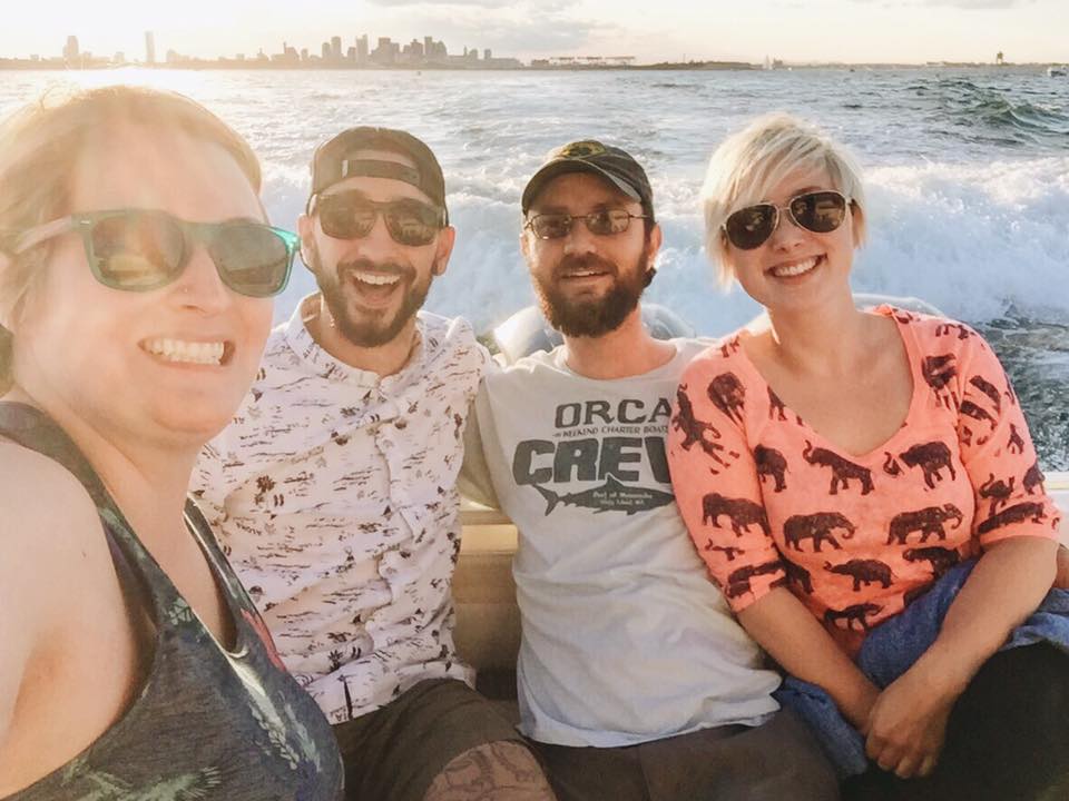
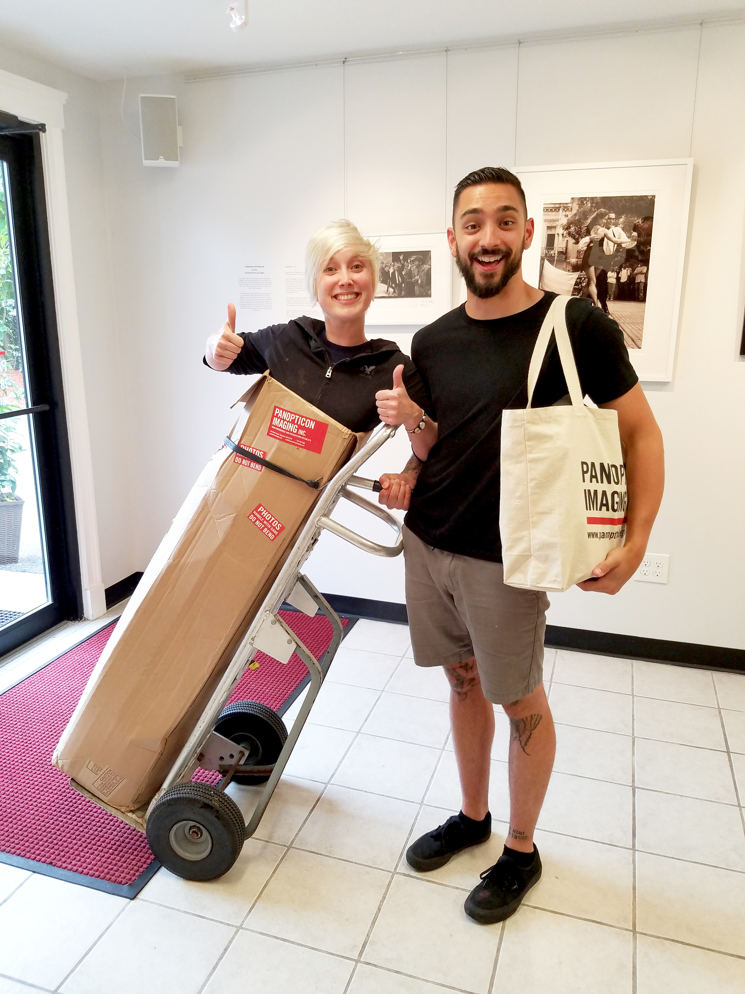
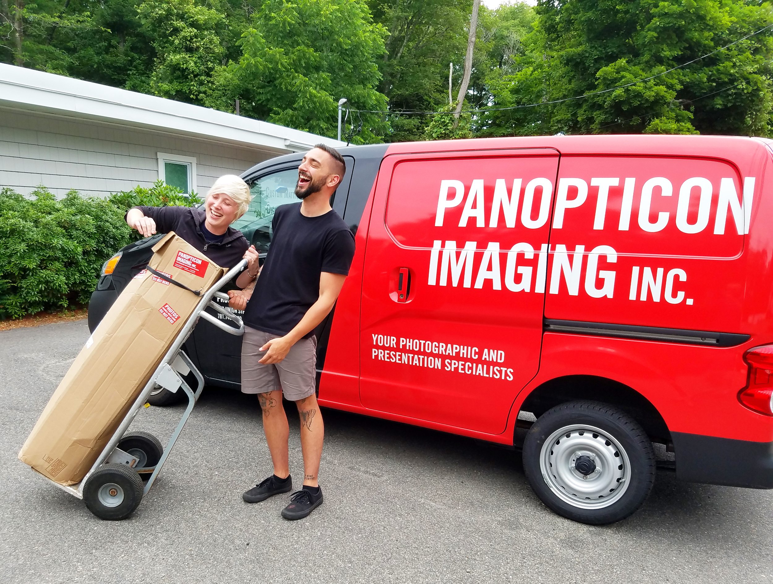
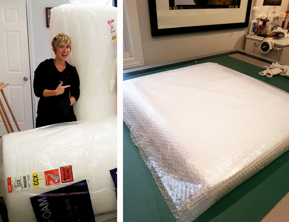
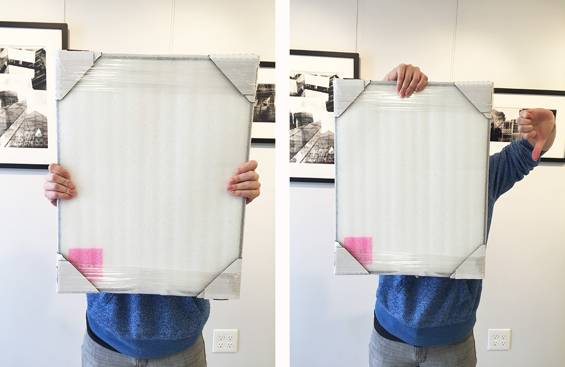
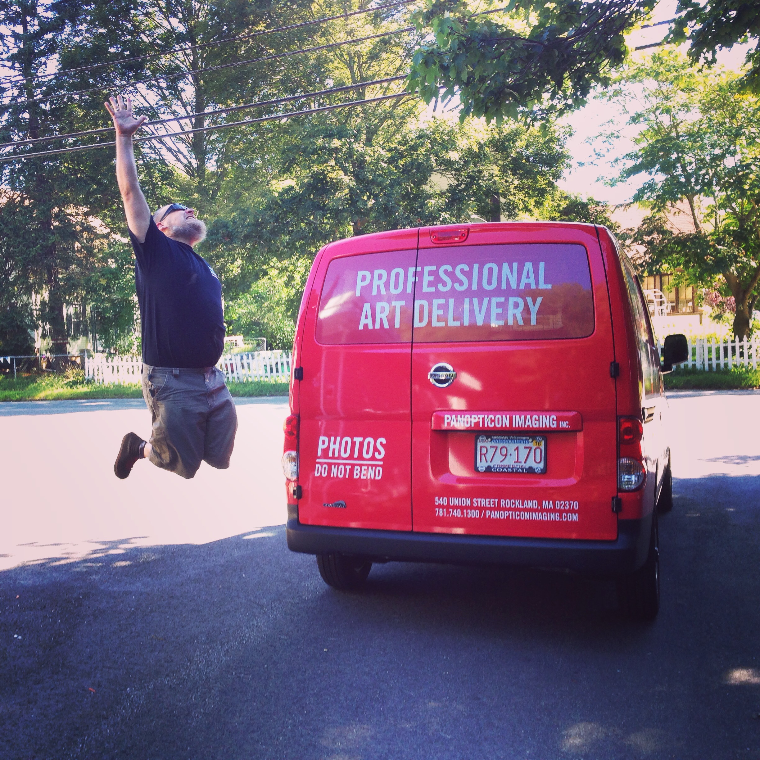
Liz is always more than happy to pitch in and is a great source of joy for us here. Most notably she became known for being easy “spooked” by Nick, Chris, and Bruce. It would happen so often there are two compilations of the spookenings. Liz also never turned down trying to fit in the various shipping boxes that would arrive in the office and it became a fun game.
But in all seriousness WE LOVE YOU SO VERY MUCH! Enjoy grad school and we know some good printer & framers in case you need help (wink wink). We truly wish you the best Liz and hope this doesn’t make you cry too much.
With all our love,
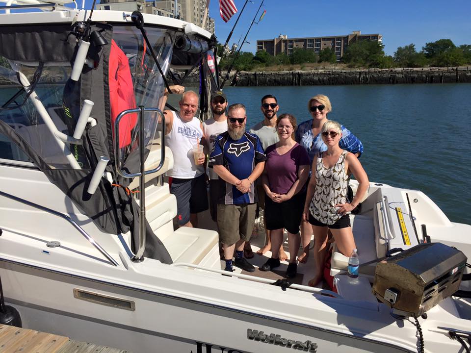
Paul, Patty, Brandon, Bruce, Chris, Elena, Nick, Sloane and Shannon


