
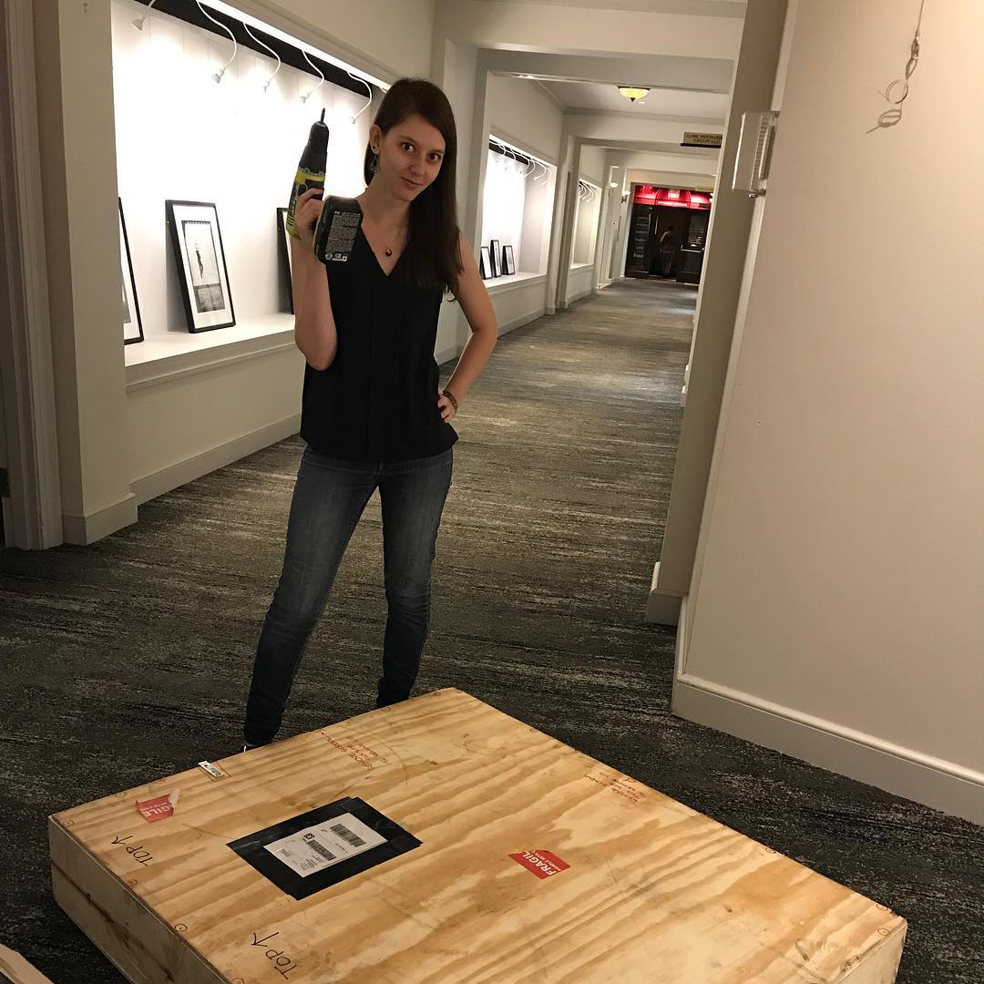
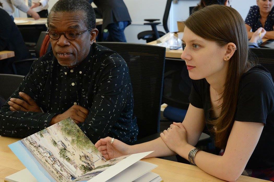
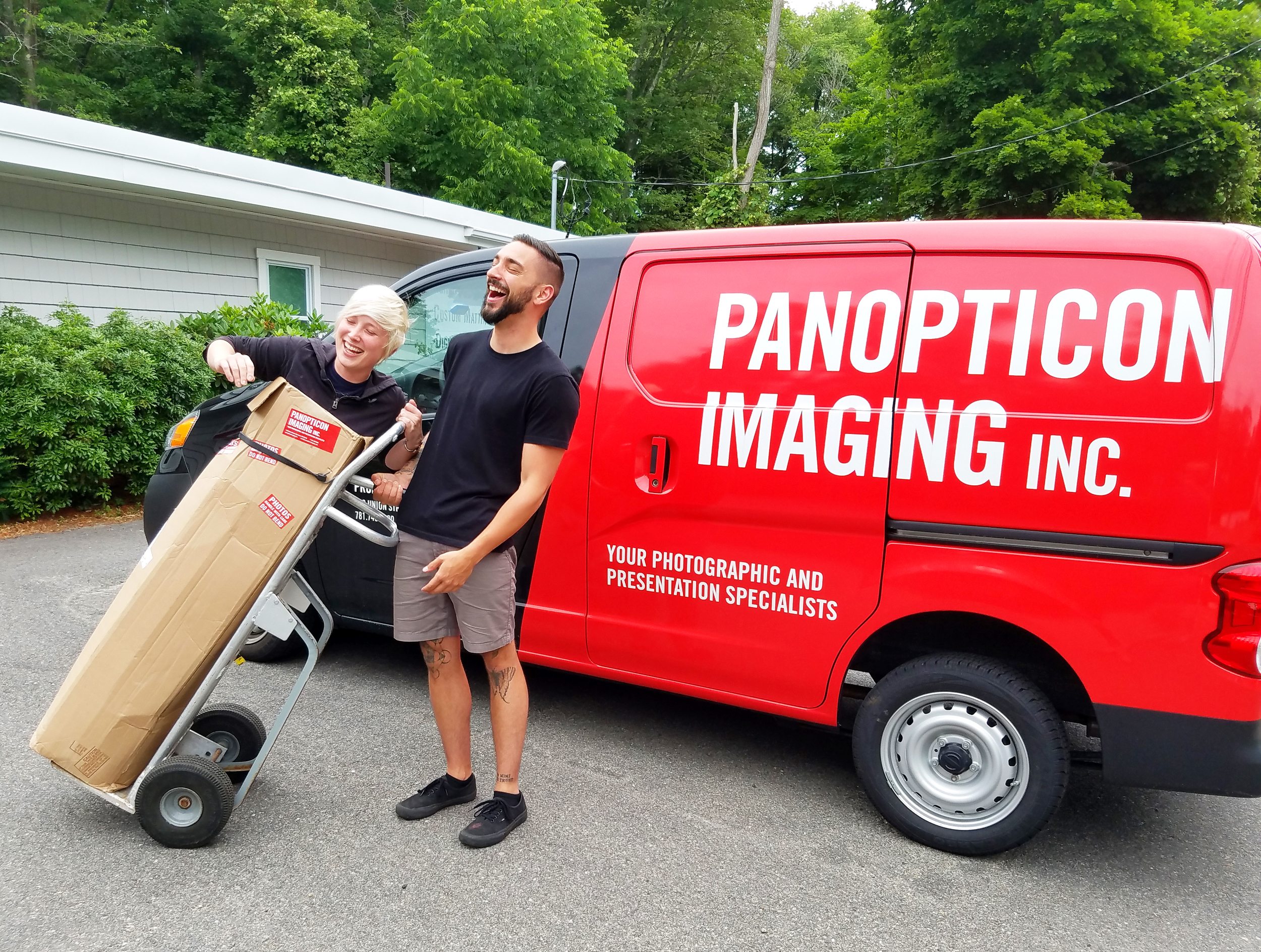
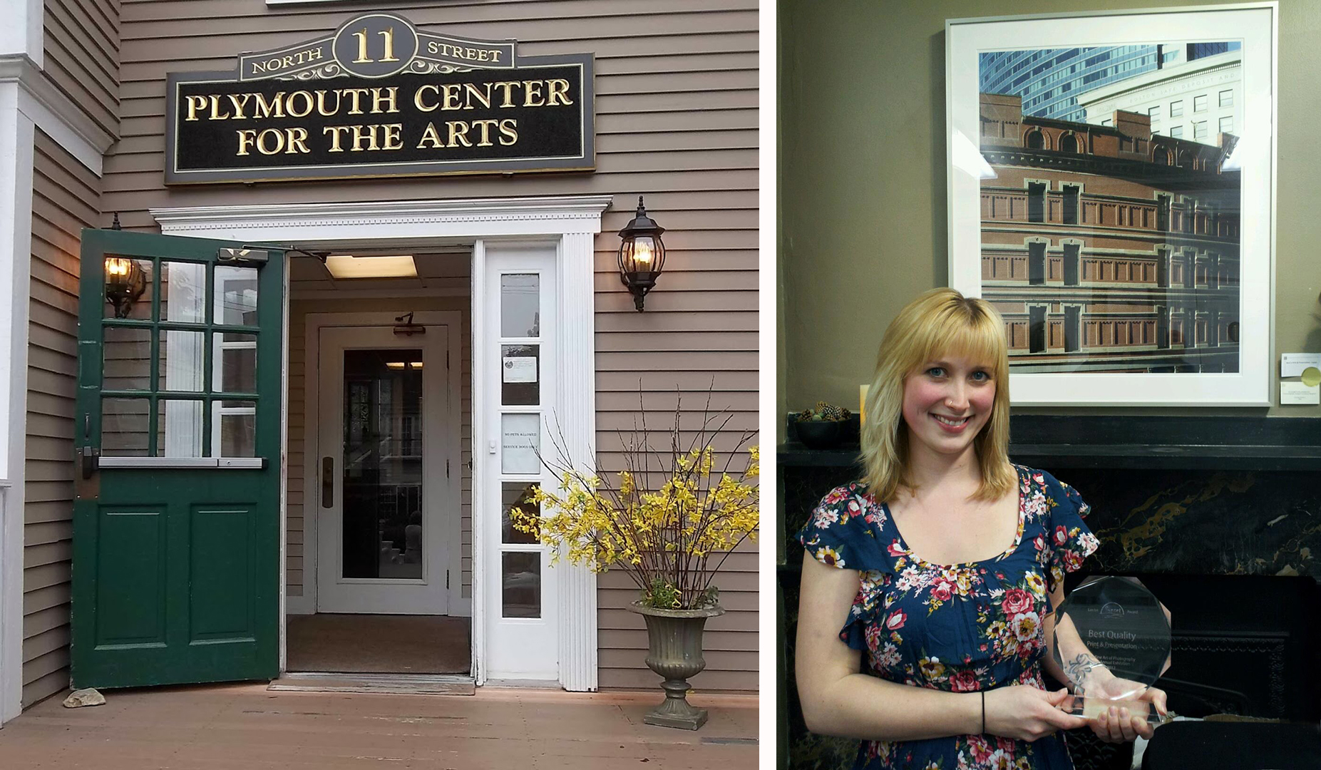
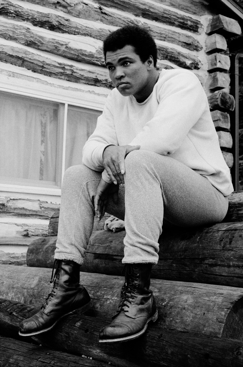
A great big welcome to Kat Kiernan! Kat is not only our amazing new gallery director, but she is also to Editor-in-Chief of Don't Take Pictures, a bi-annual publication that discusses modern photography as well as featuring talented artists. In 2015, Kat received the Griffin Museum of Photography's Rising Star award and was named one of Photoboite Agency's 30 women photographers under 30 to watch in 2012. Kat has exhibited across the country and is a widely published writer. She has a BFA in photography from Lesley University College of Art and Design (formerly the Art Institute of Boston).
You work in many aspects of the art world as the Director of Panopticon Gallery, Editor-in-Chief of Don’t Take Pictures, and as a photographer. How did you become interested in photography, curating, and writing?
Although I haven’t spent a lot of time putting my own work out into the world, everything that I do as a writer and curator stems from my own experiences as a photographer. I published my first article in a national magazine during my senior year of college to accompany my documentary photographs of people who live aboard their boats year-round in Boston. I thought that the magazine would be far more likely to publish my photographs if they were accompanied with an article, so I wrote it myself.
I began curating straight out of art school when I opened The Kiernan Gallery as a venue for photographers who, like me, were just starting to exhibit their work. I later expanded the space to curate solo exhibitions, off-site pop-ups, and other art events. Don’t Take Pictures evolved from The Kiernan Gallery just before I closed the gallery and moved to New York City. Initially, I wanted to produce an annual that would highlight the best of what we exhibited that year, but I was planning to relocate and wanted to publish something bigger and which was not tied to a specific place.
Now, as the Director of Panopticon, I am incorporating some of what I learned in New York and some of what I learned at The Kiernan Gallery into a more traditional model of representing a small group of photographs while taking a less-traditional approach to engaging with collectors. As a photographer myself, every decision I make in the gallery is based on what I would want and expect from a gallery that represents me.
Do you have a favorite non-photographic hobby?
I am not really a hobby kind of person. If I am interested in something, I tend to dive in 100% and turn it into something more. However, for a large portion of my life boating was my hobby and I still jump at the chance to crew a boat whenever I can.
What is one of your favorite exhibitions that you have seen?
I recently saw the Louis Vuitton “Volez, Voguez, Voyagez” exhibition at the American Stock Exchange in New York City. Without question, it is one of the best examples of exhibition design that I have ever seen. Each room felt like stepping onto a film set. This shouldn’t have been a surprise, considering that Louis Vuitton has one of the best visuals teams in the world. I am not as well-versed in fashion as I am in other arts, and the immersiveness of each room taught me a lot about the impact of high fashion on the last hundred years of our culture.
Who are your influences in photography, curating, and writing?
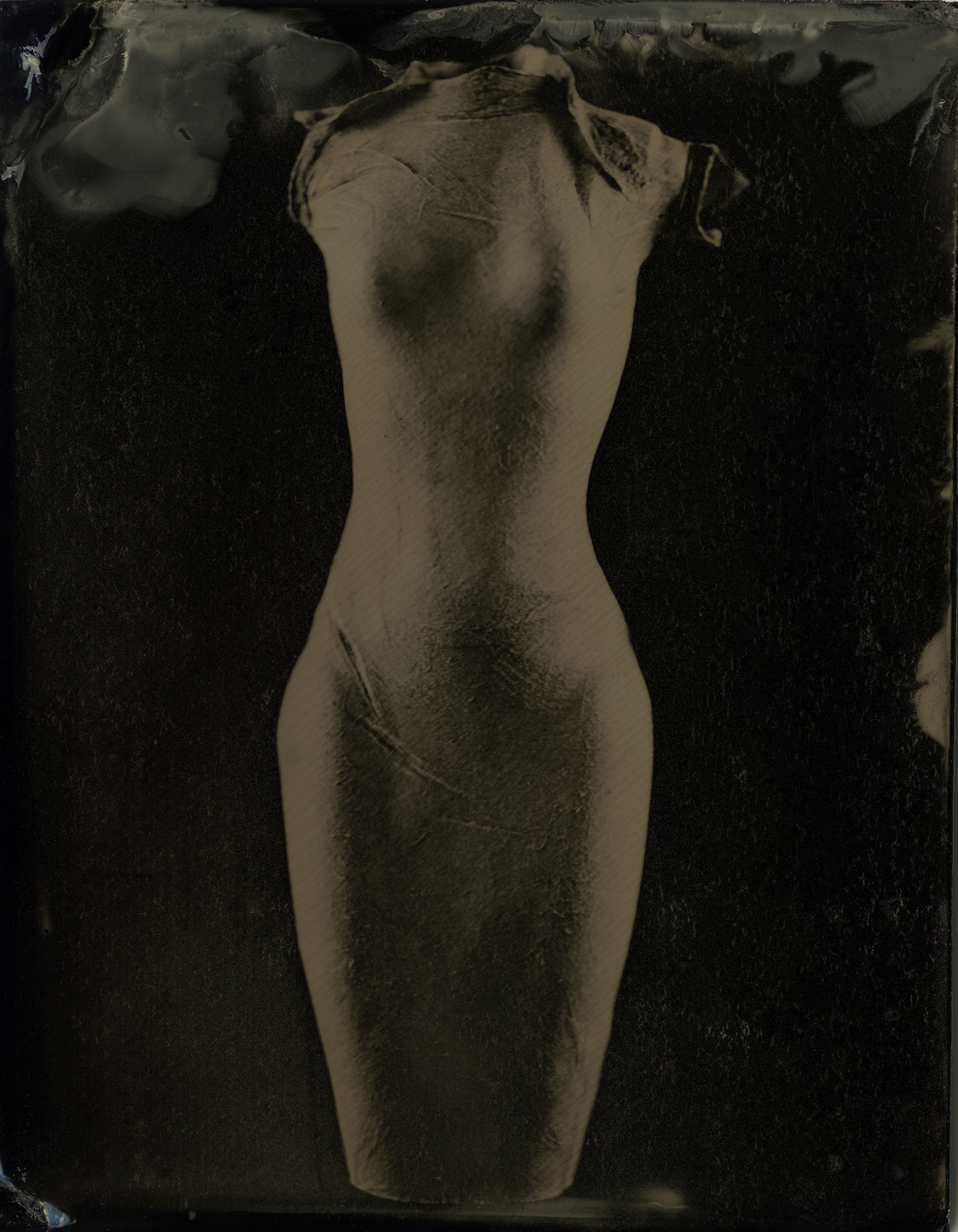
Two of the many photographers who have influenced me are Francesca Woodman for her intuitive experimentation with self-portraiture, and Arno Minnkkinen for his dedication to a life-long body of work and for the wonderful mentorship that he has given me. I am also influenced by the photographers that I have the privilege of publishing and exhibiting.
I am also influenced by Alfred Steiglez, a renaissance man who had great vision as a photographer, as the publisher of the first photography journal Camera Work, and a curator of the gallery space 291.
Vicki Goldberg is probably my biggest influence as a writer. Her writing is insightful, original, and covers a range of topics within the photographic medium. It is also very accessible as it is written for everyone, not just the academics.

What is your advice for those who want to start their own publication?
Always hold yourself accountable. A publisher must be accountable to the artists that they publish by making sure that their work is well represented (good quality reproductions, accurate information, correct and well-placed quotes). A publisher must be accountable to their writers by editing with rigor and compassion, and defending them when needed. Most importantly, a publisher must be accountable to the readers to produce the best publication possible.
A lot of magazines start out with ambitious publication schedules and, for various reasons, cannot hold to them. I publish in print twice per year and online about four times per week. As organized as I am, there have been more than a few all-nighters for the next day’s content. Writers and artists will miss deadlines, advertisers won’t pay invoices, and printers will lose proofs. None of your readers should know about any of this, and none should be expected to care. Readers care that their magazine arrives in their mailbox on time with inspiring images and insightful prose. If that doesn’t happen, your reputation as the publisher will suffer. There is no passing the buck, there is only high standards, problem-solving, and accountability.


